
Redesign homepage to improve user engagement and satisfaction
Overview
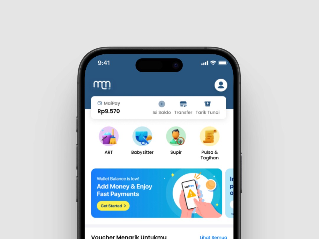
Maimaid.id is a mobile application offering a wide range of on-demand cleaning and household assistance services. The app also features a financial service called MaiPay, enabling users to Top Up, Transfer, and Withdraw their balance seamlessly. The homepage of the app is the first touchpoint for users, making it a crucial element in shaping their overall experience. This redesign project focuses on optimizing the homepage to create a more engaging, user-friendly interface that effectively communicates the app's core services and features.
Timeline
4 Days
Role
UI/UX Designer
Background
The need for reliable household assistance is a common challenge faced by many individuals, especially in urban environments. Observations from my personal network revealed that finding a suitable Household Assistant (ART) often involves trial and error, leading to frustration and wasted time. Maimaid has the potential to solve this problem by providing a platform that connects users with vetted service providers. However, the current homepage design falls short in delivering an intuitive and efficient user experience, prompting the need for a redesign.
Problem
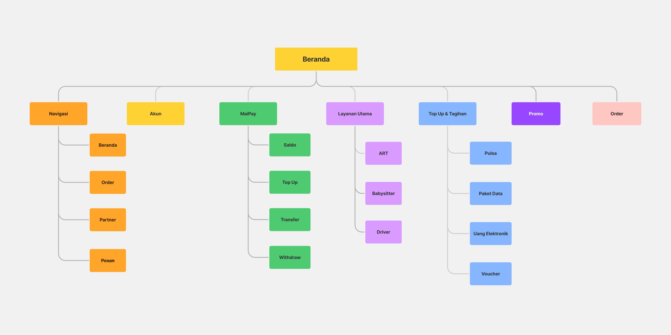
Information Architecture of Old Maimaid Homepage
Upon reviewing the existing homepage of the Maimaid app, I identified several issues that hinder user engagement and satisfaction.
Goals
After identifying the key problems, I established the following goals for the redesign.
Target Audience
To ensure the redesign meets the needs of Maimaid's target audience, I analyzed who the potential users of the Maimaid app are:
Between 25-50 years old
Location in urban areas like Jakarta, Surabaya, and Bandung
Economic status is middle to upper-middle class, with a monthly disposable income of 5 million IDR or more
Occupation is professionals, including managers, entrepreneurs, and specialists
Easy and efficient booking for household services.
Transparent pricing and fees before booking.
Seamless payment options.
Assurance of vetted and trustworthy service providers.
Competitive Benchmark
To adopt best practices, I analyzed the homepage designs of leading apps in Indonesia. This includes examining 4 major platforms, particularly those with their financial features like Go-Pay and ShopeePay. The analysis focuses on how they present: Key Features, Navigation, and Content Structure.
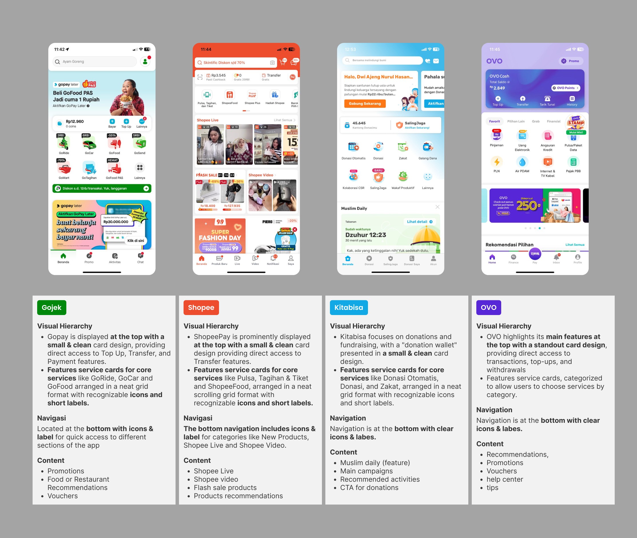
Competitive Benchmark
Key Takeaways
In this analysis, I noticed that apps like Gojek, Shopee, and Kitabisa use small, clean card designs to display financial features at the top, making it easy to access payments or donations. In contrast, OVO has a large, noticeable card for its financial options. All apps feature well-organized cards for core services at the top. Navigation is at the bottom with clear icons and labels, and the homepage includes promotions, recommendations, vouchers, tips, and a help center.
Next Steps
Based on competitive research, I identified opportunities to implement on the Maimaid homepage.
Low Fidelity
Before moving to the design phase, I created a wireframe to outline the layout, structure, and key elements of the homepage, ensuring a clear and user friendly experience.
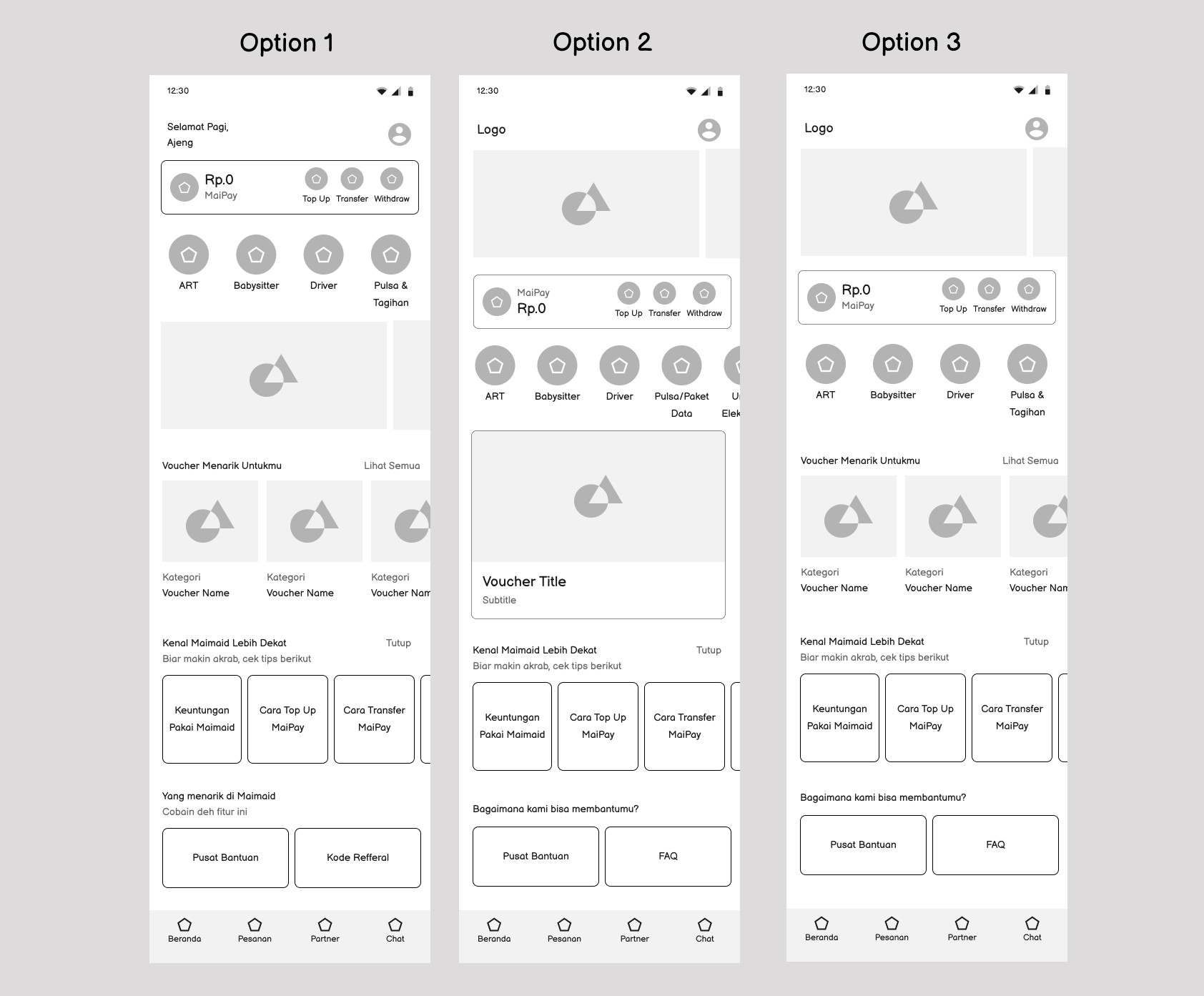
Wireframe
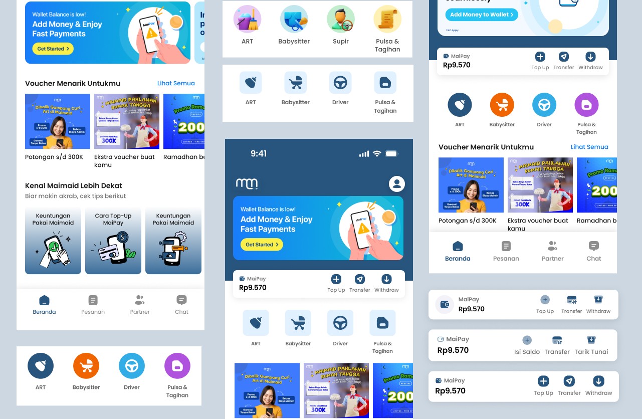
High Fidelity Design
Once the wireframes were completed, I proceeded to develop the mockup design. I applied the brand's color also selected appropriate illustrations and icons to effectively convey the information
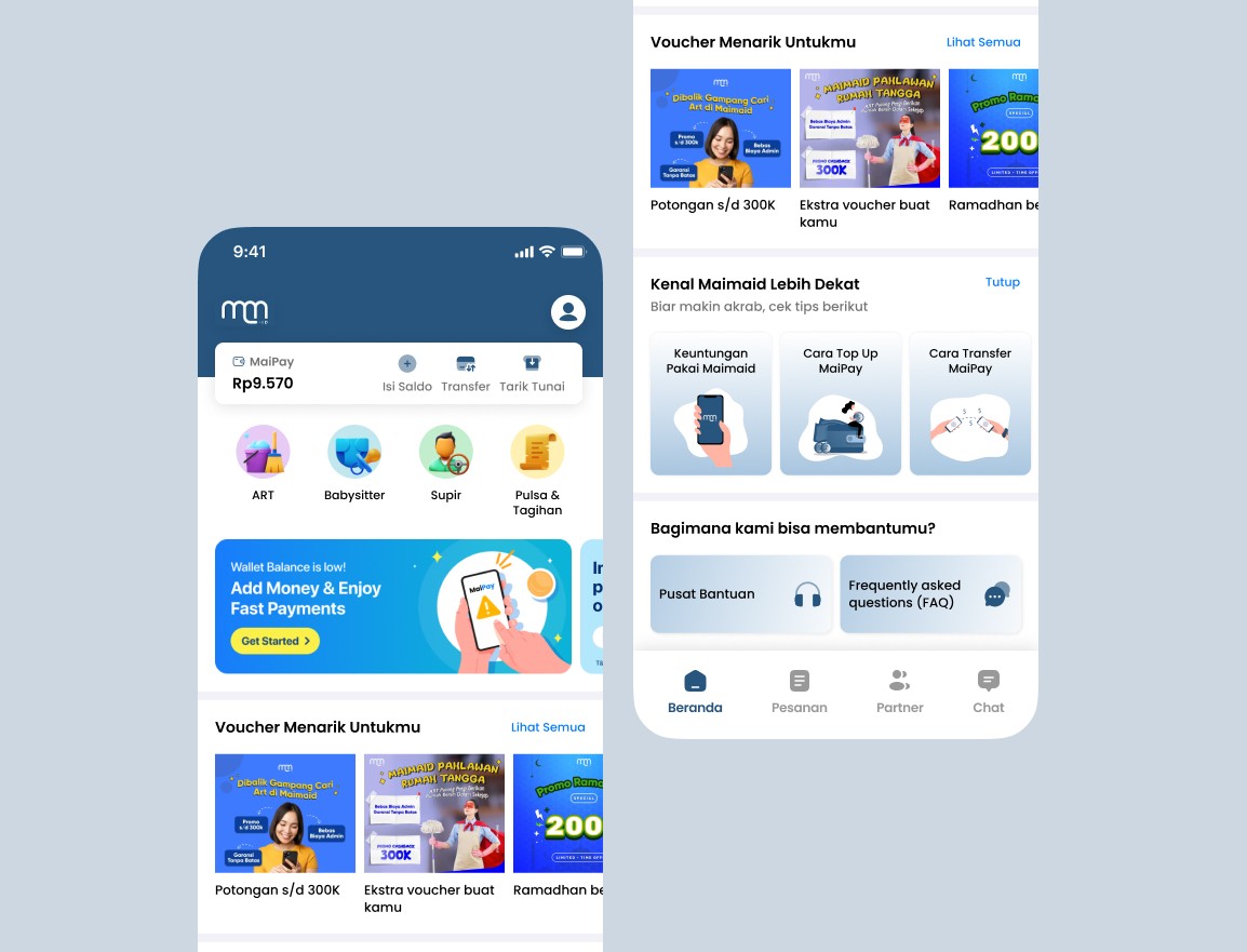
Homepage New Design
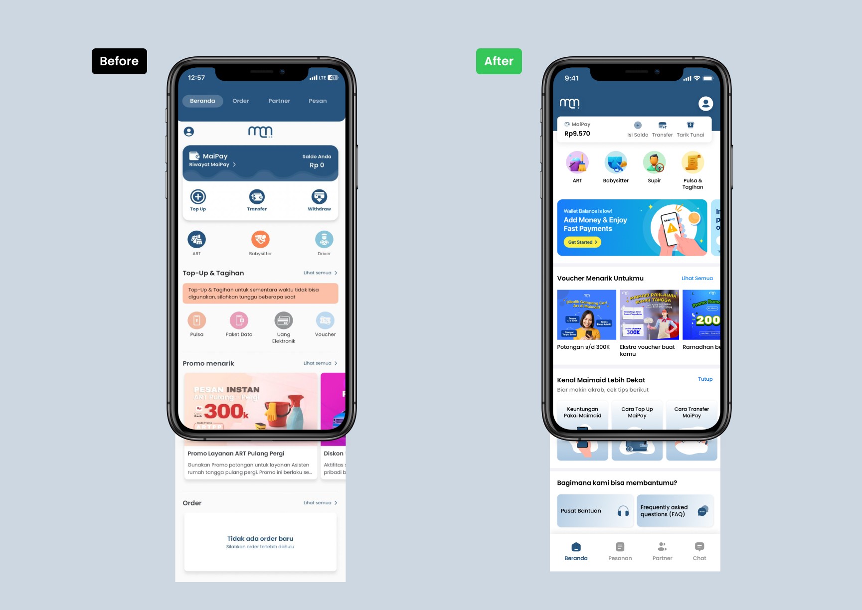
Comparison
Design Rationale
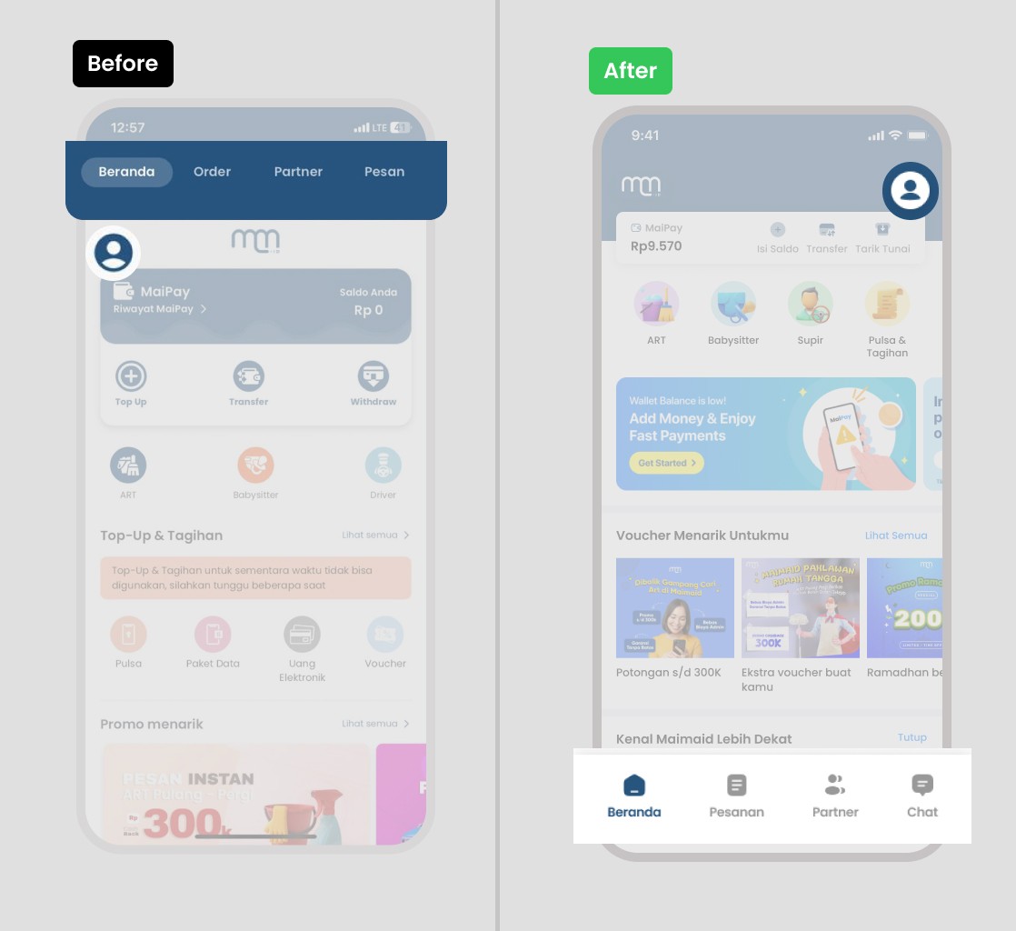
Navigation Revamp
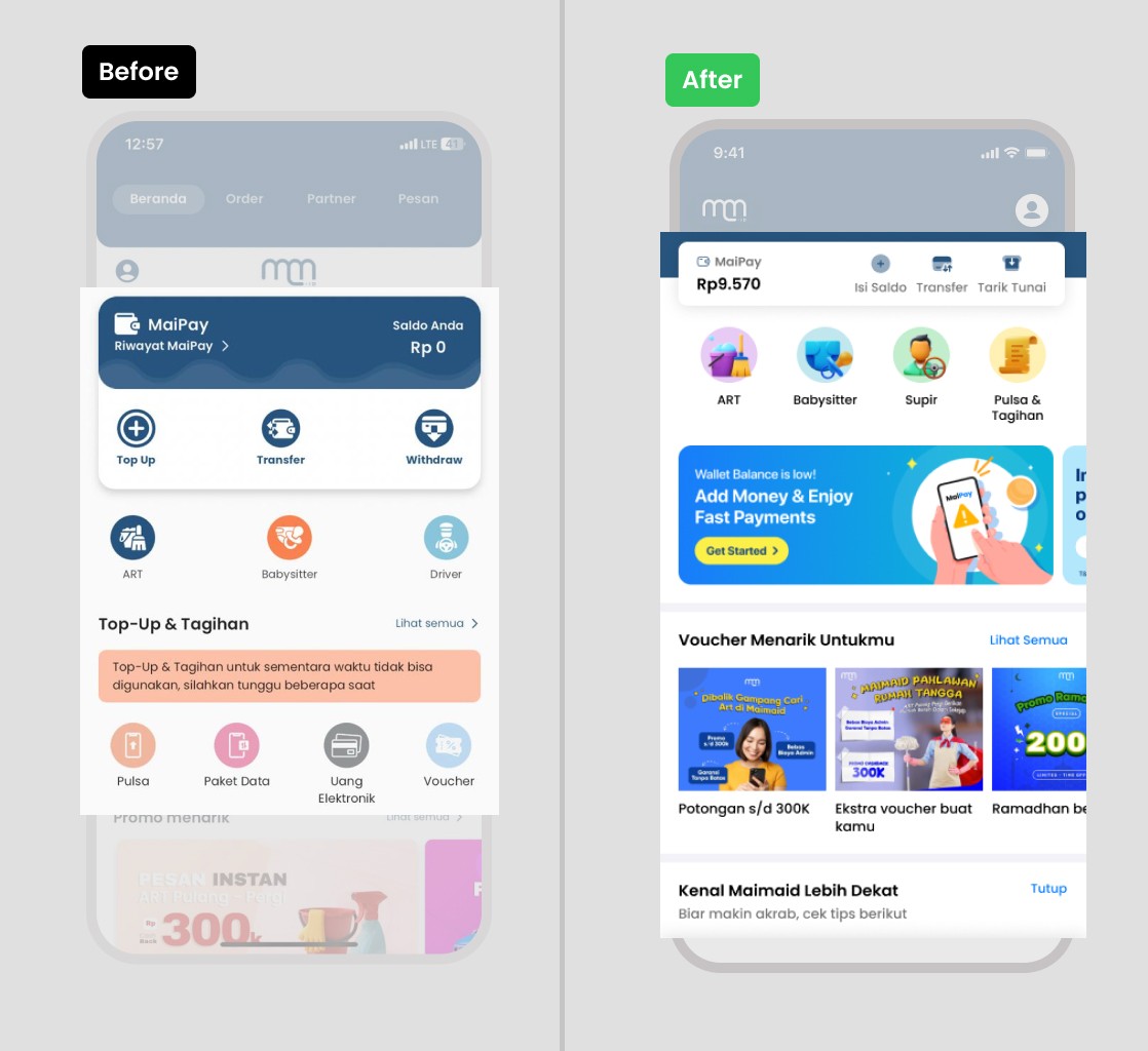
Rearranging Elements
Content Selection
Design Iteration
To create an effective design, I carefully review and rethink each part of the homepage. I look at how every element works and how it contributes to the overall user experience. By doing this, I ensure the new homepage better meets user needs and improves their experience with the Maimaid app.
Iteration Design
Impact Prediction
Leanings
Visual hierarchy plays a big role in guiding user attention, using placement, size, and contrast helps highlight what matters most.
Future Steps
Conduct A/B testing and usability testing to validate the new design, gather insights from real users, and refine the interface through iterative improvements based on feedback.