
Boosting conversions with easy consultation booking & payment features
Rata is the first brand to produce clear aligners in Indonesia, making dental services more accessible to everyone. Using AI technology, Rata’s dentists provide online consultations, analyze dental conditions with 3D video simulations, and offer personalized teeth-straightening treatments. This redesign refreshes the landing page as the first step toward revamping the entire website. The goal is to create a seamless experience that enhances user engagement and increases conversion rates.
Timeline
Feb - Jun 2024
Role
UI/UX Designer
Company
Rata (Health, Wellness, and Dental Services)
Problem
Between 2022 and 2023, Rata's website saw an increase in Leads (users who clicked the CTA button) and Chats (users who initiated a WhatsApp chat). However, the conversion rate from Leads to Chats declined, indicating that while more users were interacting with the page, the experience was not effectively guiding them toward completing the desired action. This highlights a gap in the user experience that needs to be addressed to improve conversion outcomes.
Goals
Uncovering Stakeholder Insights
The stakeholders then provided a content structure below to help shape a effective solution.
Content Structure
So, from these discussions, I identified the following key needs for the redesign:
How Might We
My goal was to create a solution that met stakeholder expectations while staying aligned with user needs.
Competitive Benchmark
To ensure Rata’s landing page redesign enhances trust and simplifies the user journey, I analyzed key competitors in the dental industry. The focus was on creating a clean and trustworthy design while making the booking and payment experience seamless and intuitive.
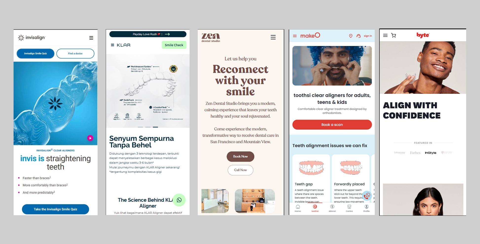
Rata's Competitor
Key Takeaways
Low Fidelity
I created wireframes to guide me in designing the mockups, particularly for the consultation booking & payment flow. I created these wireframes for the mobile layout first, as the stakeholders requested prioritizing the mobile layout.
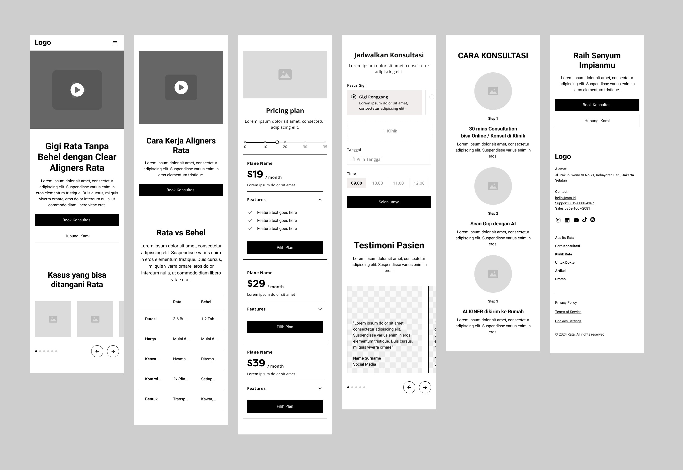
Landing Page Wireframe
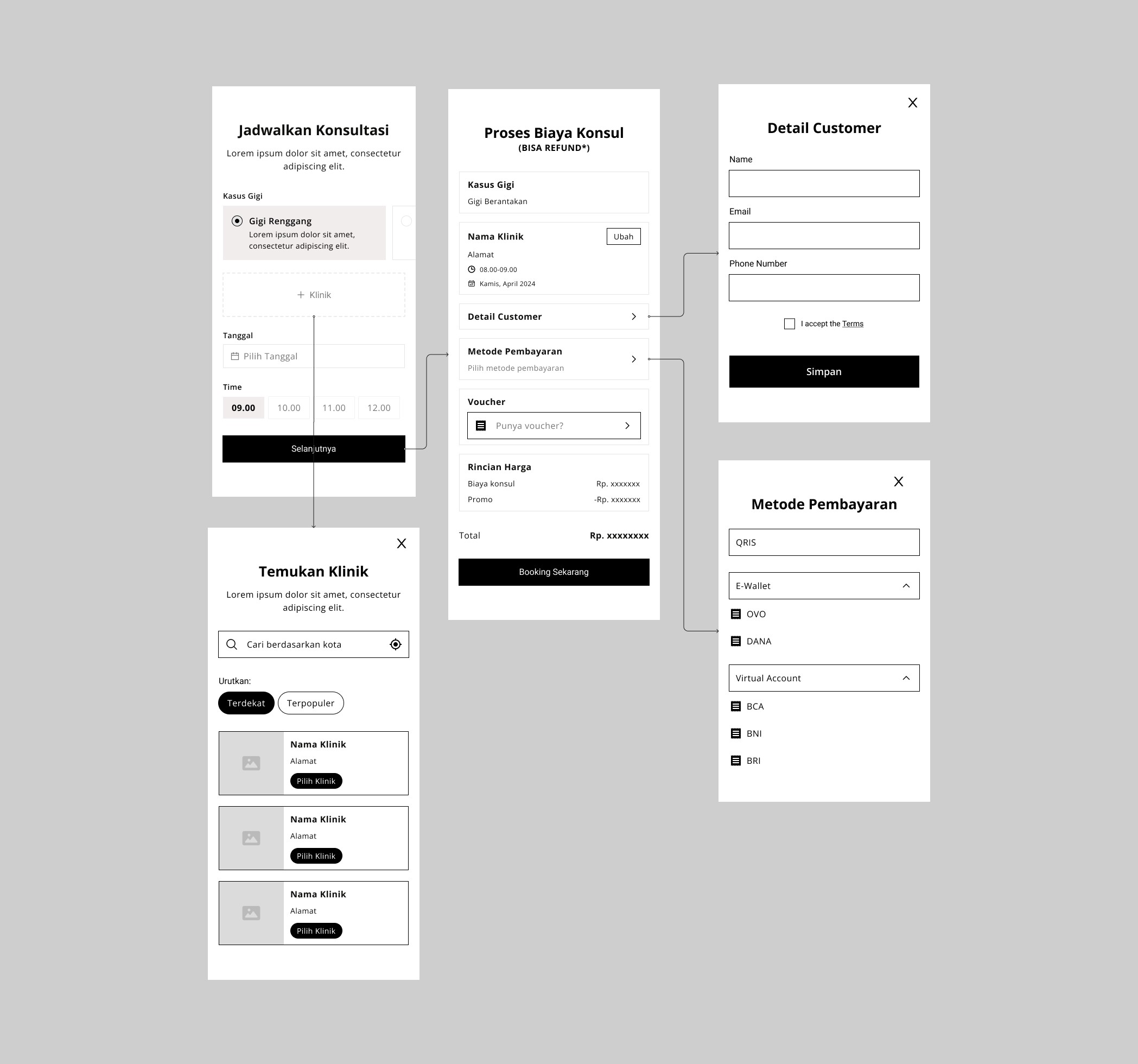
Booking Consultation Flow
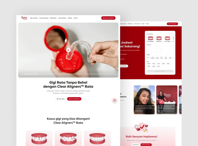
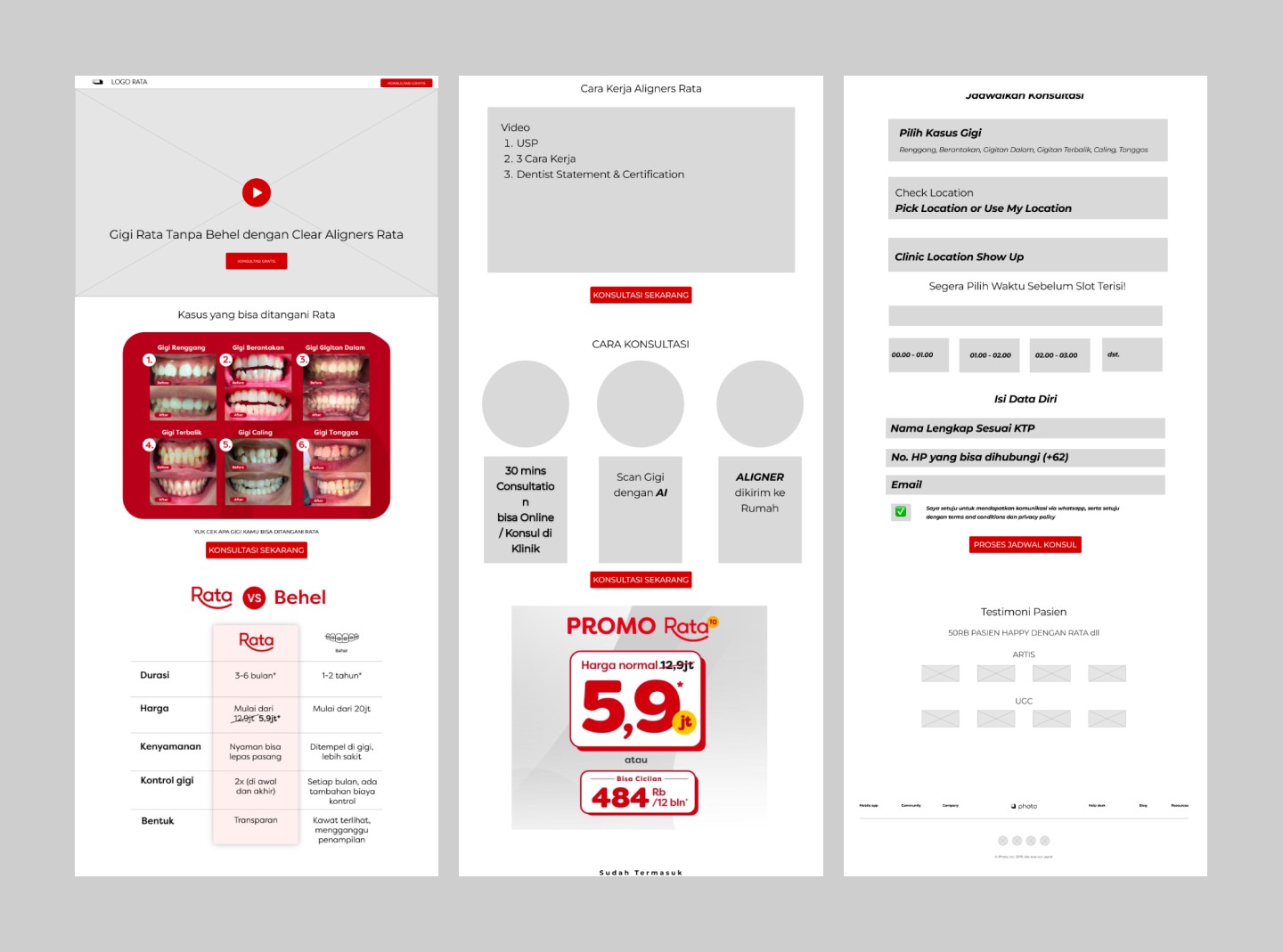
High Fidelity Design
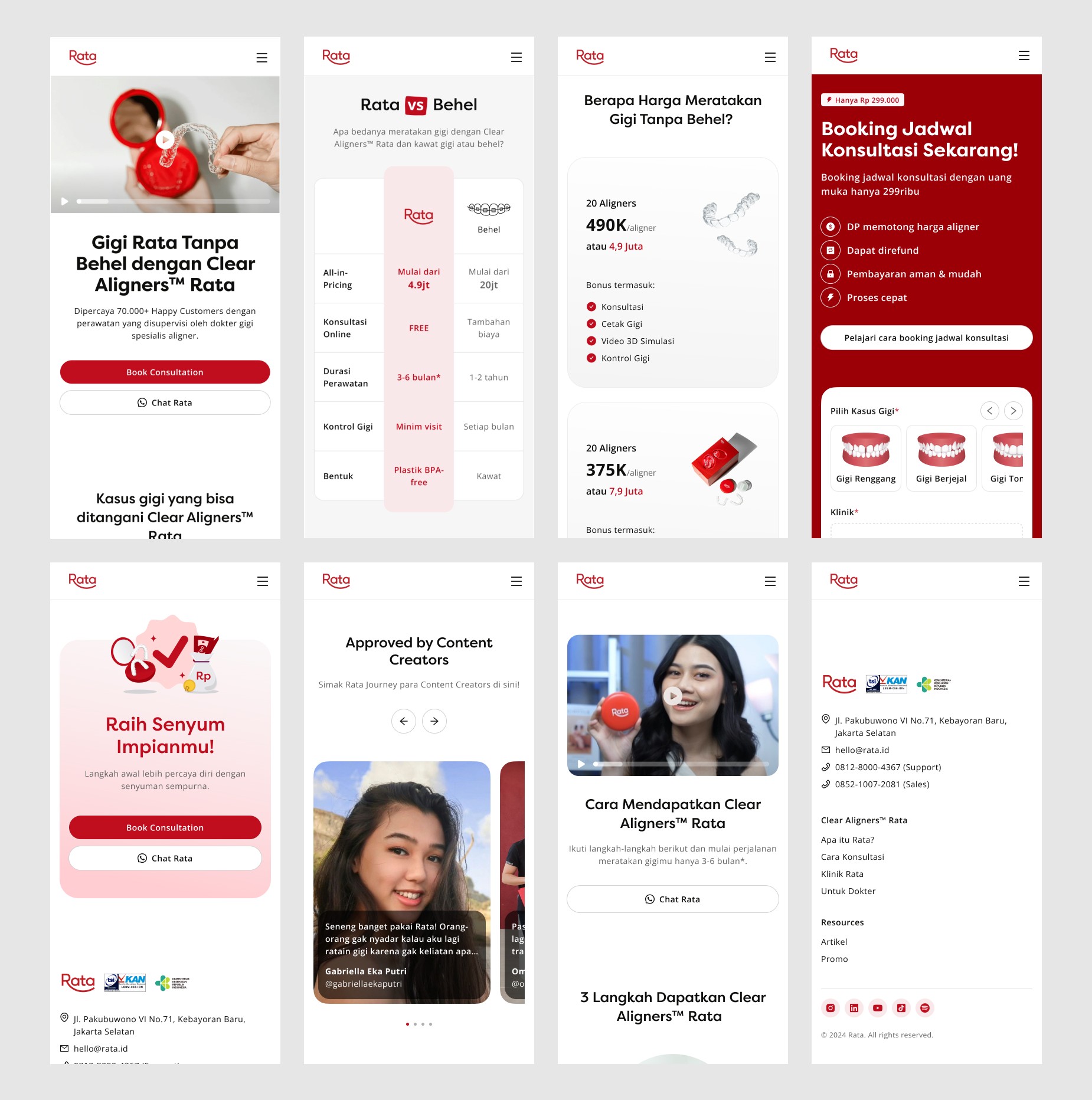
Using the wireframe as a foundation, I moved into the mockup design phase. I incorporated colors, typography, icons, images, and illustrations to bring the design to life.
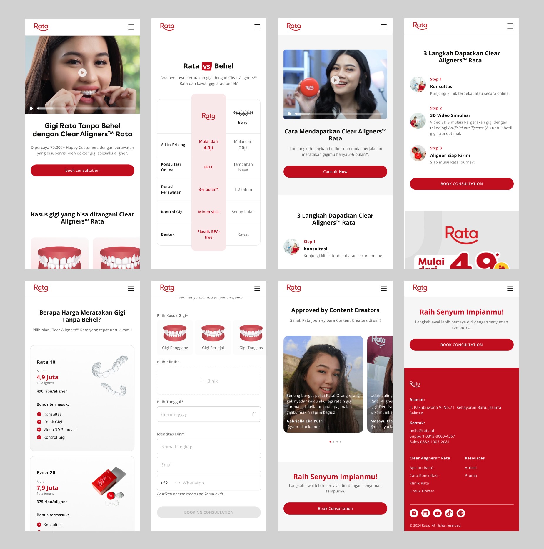
High Fidelity Design
Iteration
After designing the hi-fi mockup, I received some revision requests, leading to several adjustments to enhance the overall user experience and align with business objectives
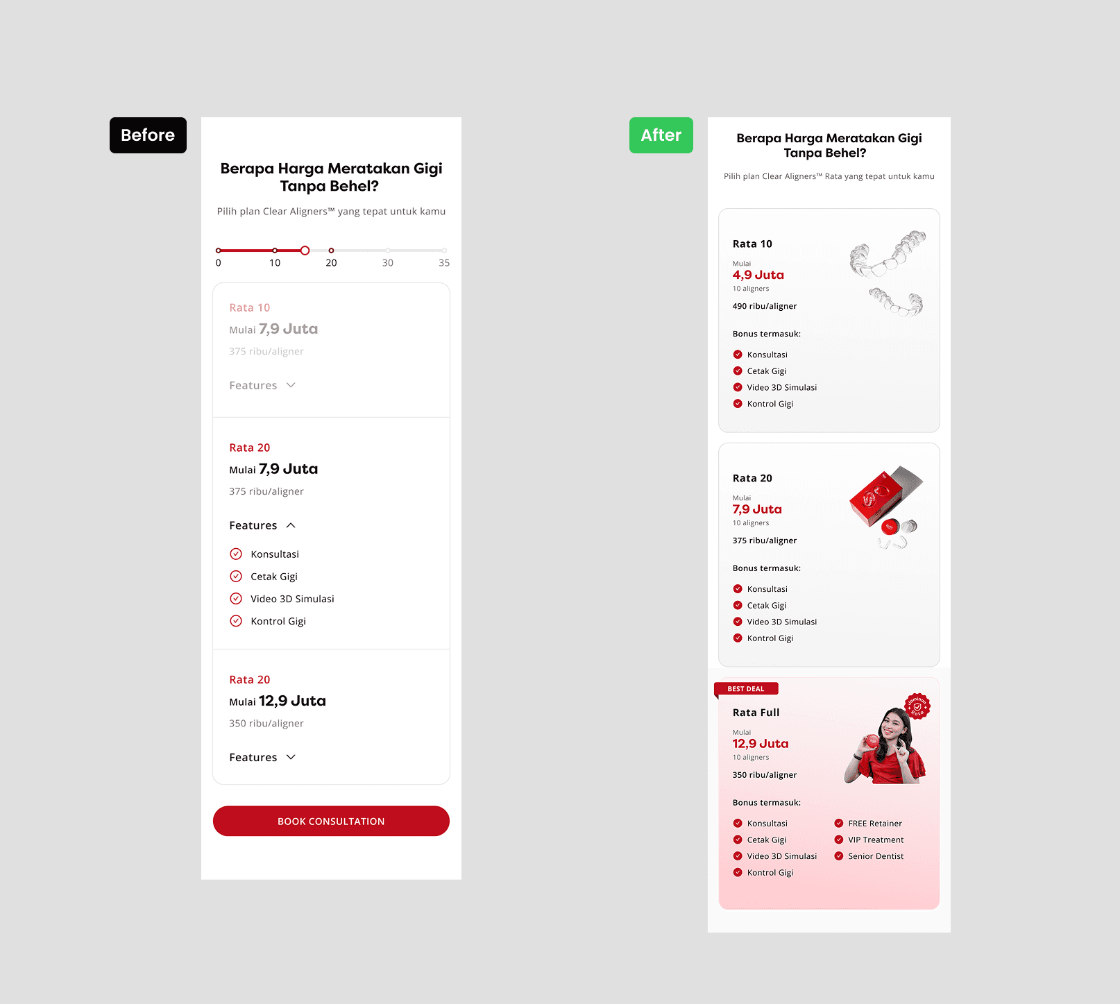
Pricing Section
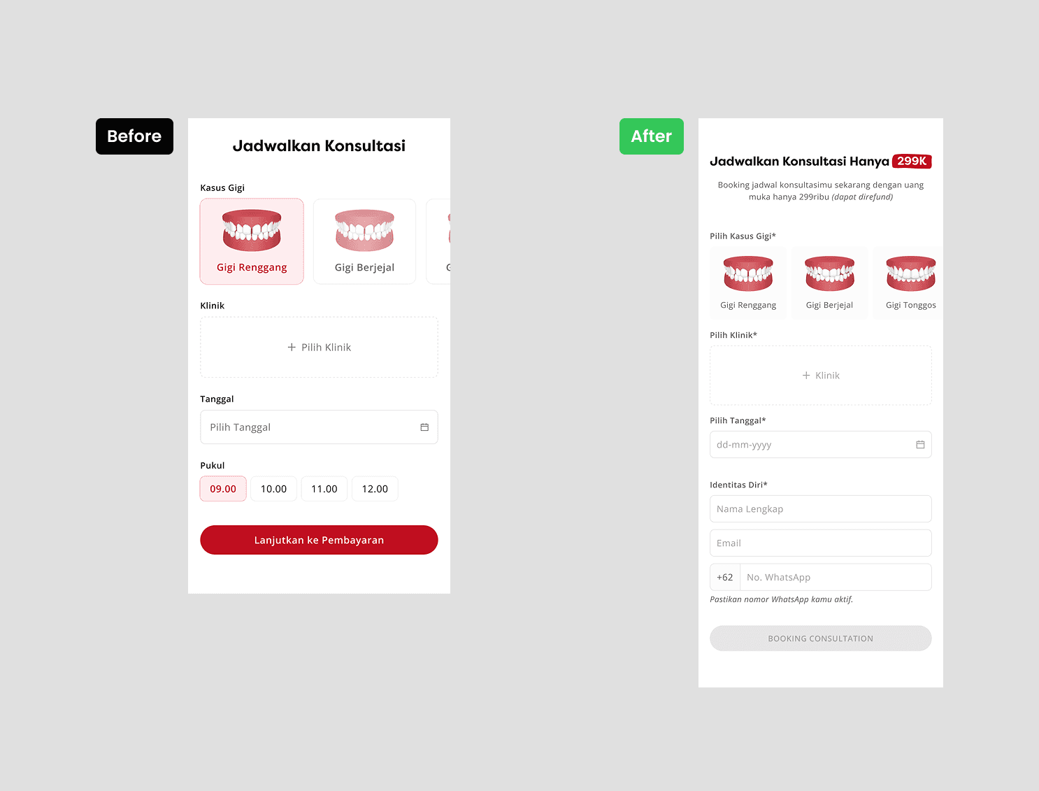
Booking Consultation Form
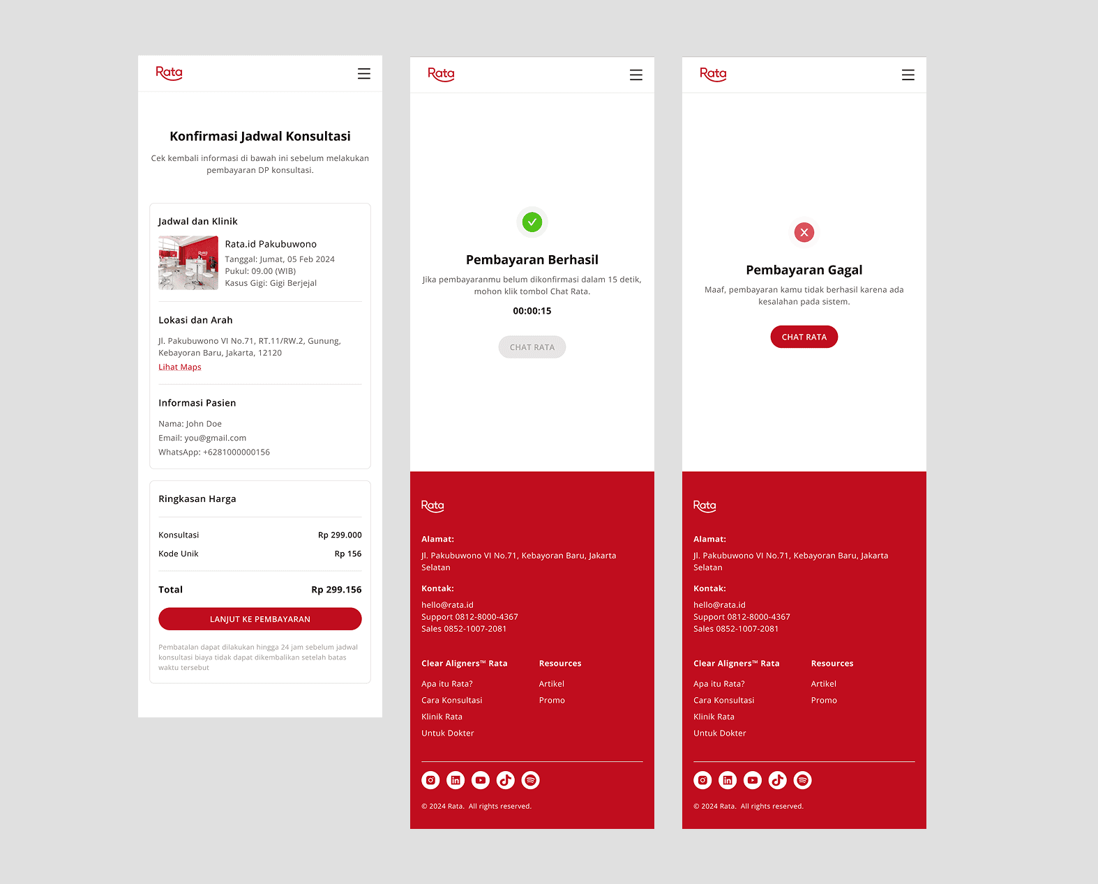
Checkout & State Pge
Result
A/B testing is planned as the next step to measure the redesign's effectiveness and alignment with project goals. However, this phase is currently on hold due to internal considerations. Once resumed, the testing will provide valuable insights to optimize the design and ensure its success.
Future Steps
After rethinking the landing page’s purpose and flow, I identified several areas for improvement, particularly the consultation booking & payment sections, which previously lacked clarity and provided insufficient information. In the redesigned version:
I added clear and detailed information, specifically about the benefits of booking and how to book, to create a more seamless and intuitive user experience.
I enhanced the visual design to increase user engagement by making the interface feel more modern and trustworthy.
These improvements aim to deliver a better overall experience, and I hope they can be implemented to help the product achieve stronger conversion and greater user satisfaction.
Further design improvements
Challenges & Learnings
One of the main challenges was implementing the new consultation booking and payment system while maintaining a user-friendly experience. Iterations were made based on internal feedback, ensuring that the booking and payment process was intuitive and seamless. This project taught me the value of balancing new feature implementation with simplicity in design to avoid overwhelming users.